library(readr)
library(ggplot2)Statistik 3: Demo
Demoscript herunterladen (.qmd)
Korrelation vs. Regression
# Datensatz zum Einfluss von Stickstoffdepositionen auf den Pflanzenartenreichtum
df <- read_delim("datasets/stat/Nitrogen.csv", delim = ";")
summary(df)
N_deposition Species_richness
Min. : 2.00 Min. :12.0
1st Qu.: 9.00 1st Qu.:17.5
Median :20.00 Median :21.0
Mean :20.53 Mean :20.2
3rd Qu.:30.50 3rd Qu.:23.0
Max. :55.00 Max. :28.0 # Plotten der Beziehung
ggplot(df, aes(N_deposition, Species_richness)) +
geom_point()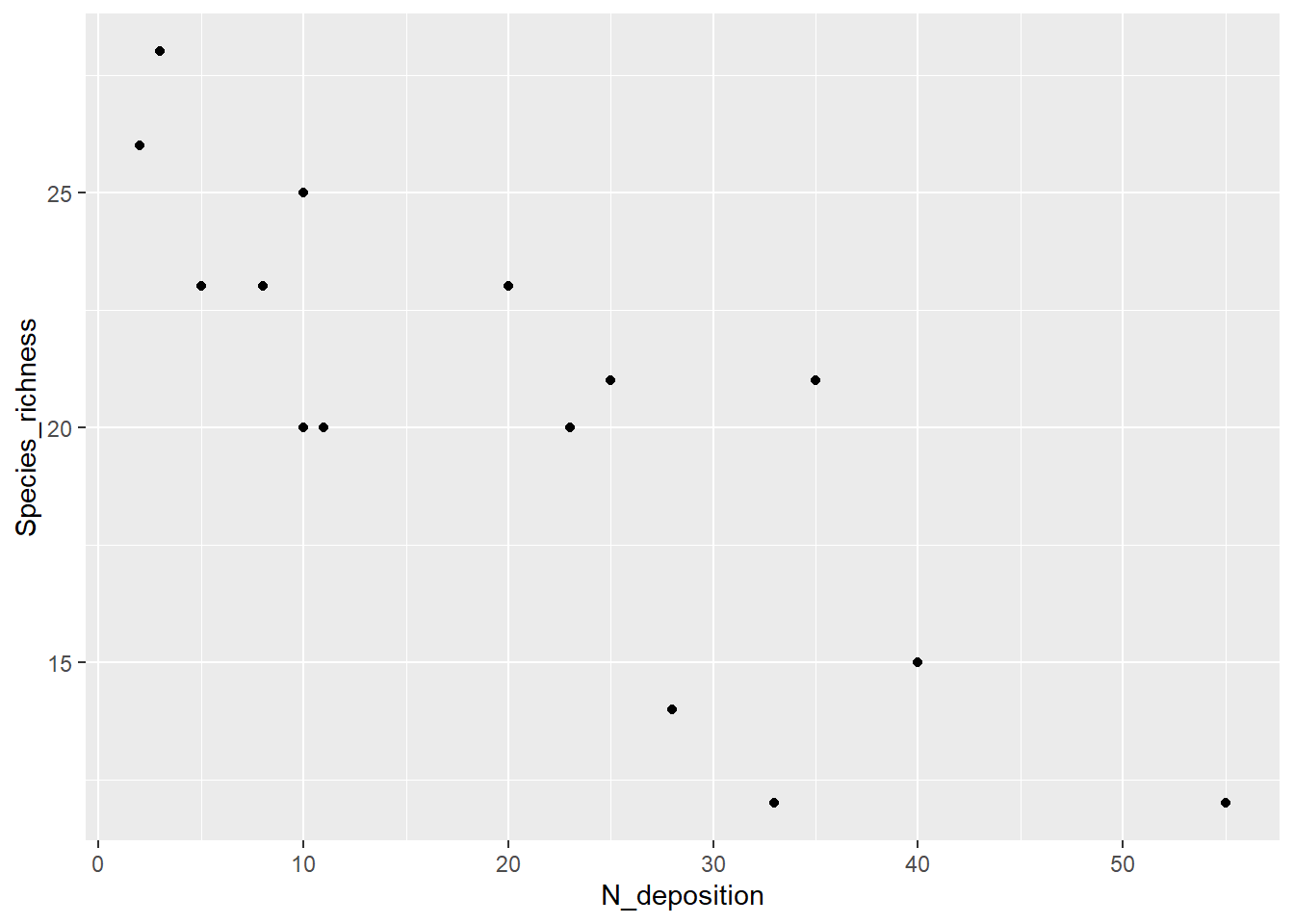
# Pearson Korrelation
# zuerst Species_richness dann N_deposition
cor.test(df$Species_richness, df$N_deposition, method = "pearson")
    Pearson's product-moment correlation

data:  df$Species_richness and df$N_deposition
t = -5.2941, df = 13, p-value = 0.0001453
alternative hypothesis: true correlation is not equal to 0
95 percent confidence interval:
 -0.9405572 -0.5450218
sample estimates:
       cor
-0.8265238
# Pearson Korrelation
# zuerst N_deposition dann Species_richness
cor.test(df$N_deposition, df$Species_richness, method = "pearson")
    Pearson's product-moment correlation

data:  df$N_deposition and df$Species_richness
t = -5.2941, df = 13, p-value = 0.0001453
alternative hypothesis: true correlation is not equal to 0
95 percent confidence interval:
 -0.9405572 -0.5450218
sample estimates:
       cor
-0.8265238
# Rang-Korrelation Spearman
cor.test(df$Species_richness, df$N_deposition, method = "spearman")
    Spearman's rank correlation rho

data:  df$Species_richness and df$N_deposition
S = 1015.5, p-value = 0.0002259
alternative hypothesis: true rho is not equal to 0
sample estimates:
       rho
-0.8133721
# Rang-Korrelation Kendall
cor.test(df$Species_richness, df$N_deposition, method = "kendall")
    Kendall's rank correlation tau

data:  df$Species_richness and df$N_deposition
z = -3.308, p-value = 0.0009398
alternative hypothesis: true tau is not equal to 0
sample estimates:
      tau
-0.657115
# Jetzt als Regression
# zuerst Species_richness dann N_deposition
lm_1 <- lm(Species_richness ~ N_deposition, data = df)
lm_1
Call:
lm(formula = Species_richness ~ N_deposition, data = df)

Coefficients:
 (Intercept)  N_deposition
     25.6050       -0.2632
# zuerst N_deposition dann Species_richness
lm(N_deposition ~ Species_richness, data = df)
Call:
lm(formula = N_deposition ~ Species_richness, data = df)

Coefficients:
     (Intercept)  Species_richness
72.957 -2.595 summary(lm_1)
Call:
lm(formula = Species_richness ~ N_deposition, data = df)

Residuals:
    Min      1Q  Median      3Q     Max
-4.9184 -1.9992  0.4493  2.0015  4.6081

Coefficients:
             Estimate Std. Error t value Pr(>|t|)
(Intercept)  25.60502    1.26440  20.251 3.25e-11 ***
N_deposition -0.26323    0.04972  -5.294 0.000145 ***
---
Signif. codes:  0 '***' 0.001 '**' 0.01 '*' 0.05 '.' 0.1 ' ' 1

Residual standard error: 2.889 on 13 degrees of freedom
Multiple R-squared:  0.6831,    Adjusted R-squared:  0.6588
F-statistic: 28.03 on 1 and 13 DF,  p-value: 0.0001453
# Signifikantes Ergebnis visualisieren
ggplot(df, aes(x = N_deposition, y = Species_richness)) +
geom_point() +
geom_abline(intercept = lm_1$coefficients[1], slope = lm_1$coefficients[2],
color = "blue")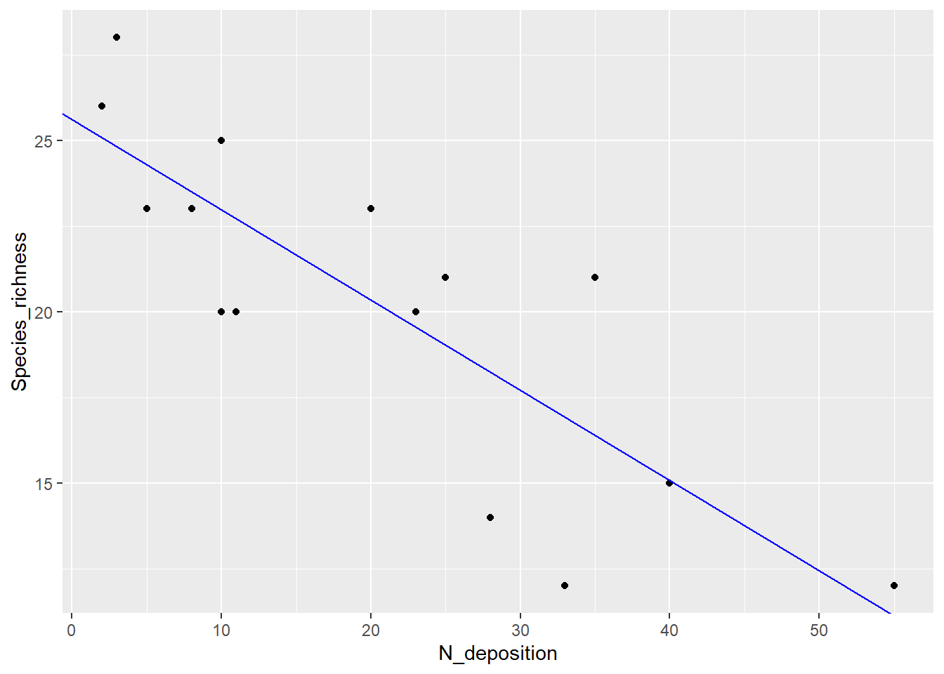
Einfache und Polynomische Regression
# Daten generieren

# "pred" sei unsere unabhängige Variable
pred <- c(20, 19, 25, 10, 8, 15, 13, 18, 11, 14, 25, 39, 38, 28, 24)

# "resp" sei unsere abhängige Variable
resp <- c(12, 15, 10, 7, 2, 10, 12, 11, 13, 10, 9, 2, 4, 7, 13)

# Dataframe erstellen
df_2 <- data.frame(pred, resp)

# Daten anschauen
ggplot(df_2, aes(pred, resp)) +
  geom_point()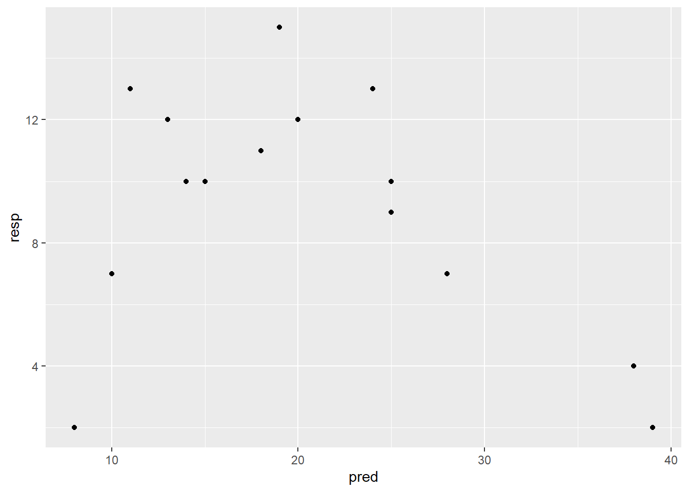
# Modell definieren und anschauen

# Einfaches lineares Modell
lm_1 <- lm(resp ~ pred, data = df_2)

# Modell anschauen
summary(lm_1)
Call:
lm(formula = resp ~ pred, data = df_2)

Residuals:
    Min      1Q  Median      3Q     Max
-9.0549 -1.7015  0.5654  2.0617  5.6406

Coefficients:
            Estimate Std. Error t value Pr(>|t|)
(Intercept)  12.2879     2.4472   5.021 0.000234 ***
pred         -0.1541     0.1092  -1.412 0.181538
---
Signif. codes:  0 '***' 0.001 '**' 0.01 '*' 0.05 '.' 0.1 ' ' 1

Residual standard error: 3.863 on 13 degrees of freedom
Multiple R-squared:  0.1329,    Adjusted R-squared:  0.06622
F-statistic: 1.993 on 1 and 13 DF,  p-value: 0.1815
-> kein signifikanter Zusammenhang im einfachen linearen Modell und entsprechend kleines Bestimmtheitsmass (adj. R2 = 0.07)
# Polynomische Regression Modell definieren und anschauen

# lineares Modell mit quadratischem Termsummary
lm_quad <- lm(resp ~ pred + I(pred^2), data = df_2)

# lineares Modell mit quadratischem Term anschauen
summary(lm_quad)
Call:
lm(formula = resp ~ pred + I(pred^2), data = df_2)

Residuals:
    Min      1Q  Median      3Q     Max
-4.3866 -1.1018 -0.2027  1.3831  4.4211

Coefficients:
             Estimate Std. Error t value Pr(>|t|)
(Intercept) -2.239308   3.811746  -0.587  0.56777
pred         1.330933   0.360105   3.696  0.00306 **
I(pred^2)   -0.031587   0.007504  -4.209  0.00121 **
---
Signif. codes:  0 '***' 0.001 '**' 0.01 '*' 0.05 '.' 0.1 ' ' 1

Residual standard error: 2.555 on 12 degrees of freedom
Multiple R-squared:  0.6499,    Adjusted R-squared:  0.5915
F-statistic: 11.14 on 2 and 12 DF,  p-value: 0.001842
-> Signifikanter Zusammenhang und viel besseres Bestimmtheitsmass (adj. R2 = 0.60)
# Modelle darstellen

# Vorhersagen der Modelle generieren

# 100 x-Werte, mit denen man die Modelle "füttern" kann
xv <- seq( min(df_2$pred), max(df_2$pred), length = 100)

# Vorhersagen des linearen Modells für die y-Werte
y_lm_1 <- predict(lm_1, data.frame(pred = xv) )

# Vorhersagen des quadratischen Modells für die y-Werte
y_lm_quad <- predict(lm_quad, data.frame(pred = xv))

ModPred <- data.frame(xv, y_lm_1, y_lm_quad)

# Modellvorhersagen plotten
ggplot(df_2, aes(x = pred, y = resp)) +
  geom_point() +
  geom_line(data = ModPred, aes(x = xv, y = y_lm_1),
            color = "red", linetype = "dashed") +
  geom_line(data = ModPred, aes(x = xv, y = y_lm_quad), color = "blue")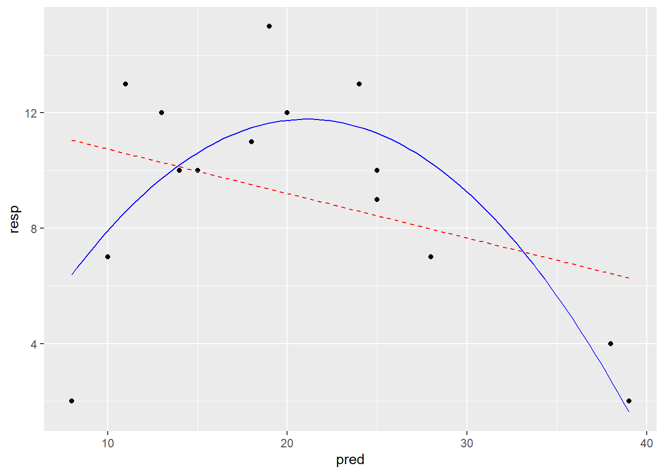
# Mit der funktion geom_smooth welche predict im Hintergrund verwendet
ggplot(df_2, aes(x = pred, y = resp)) +
  geom_point() +
  geom_smooth(method = "lm", formula = y ~ x, color = "red", linetype = "dashed",
              se = FALSE) +
  geom_smooth(method = "lm", formula = y ~ x + I(x^2),
              color = "blue", se = FALSE)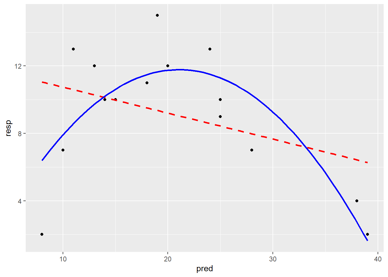
# Residualplots
par(mfrow = c(2, 2))
plot(lm_1, main = "Lineares Modell")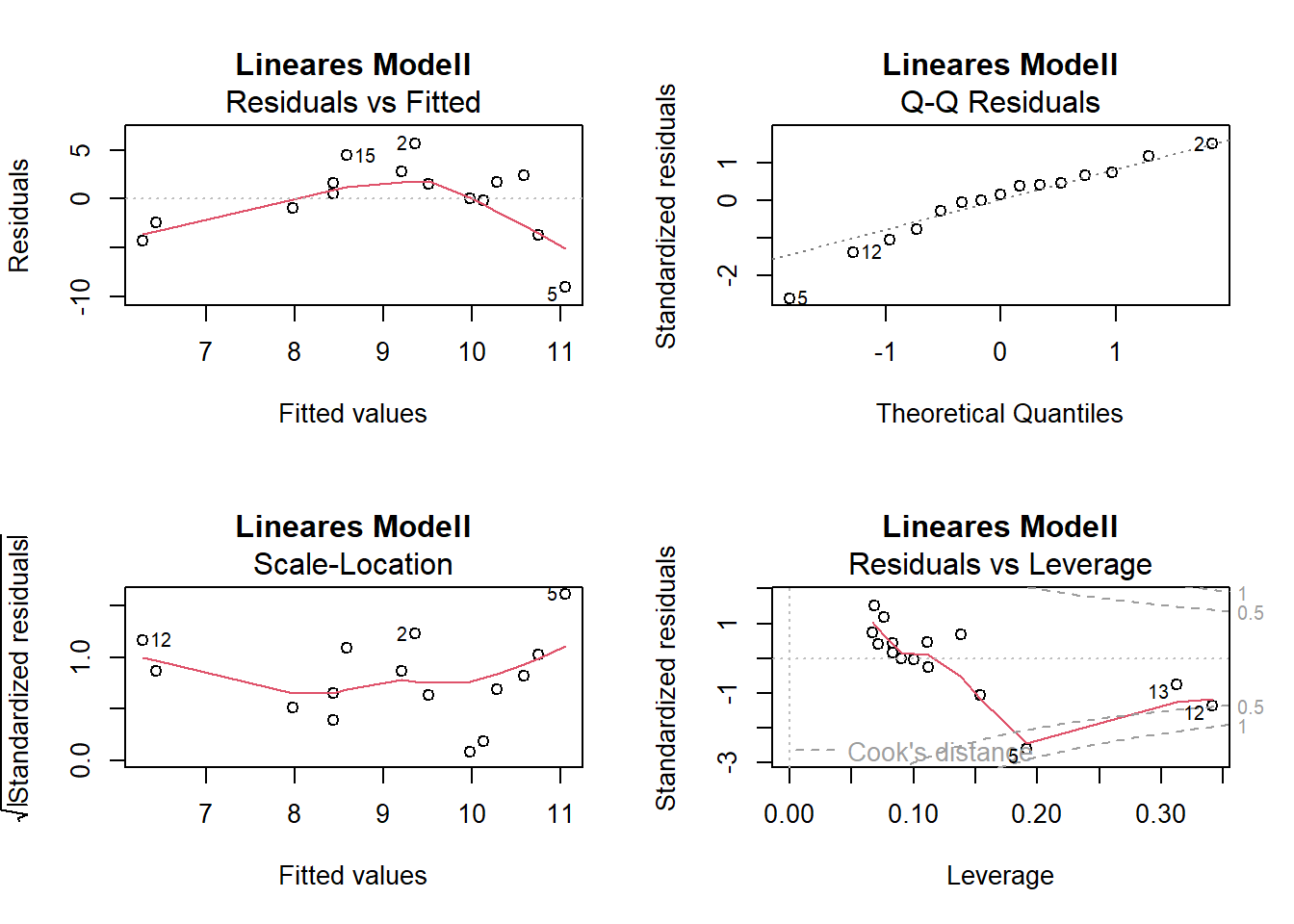
plot(lm_quad, main = "Quadratisches Modell")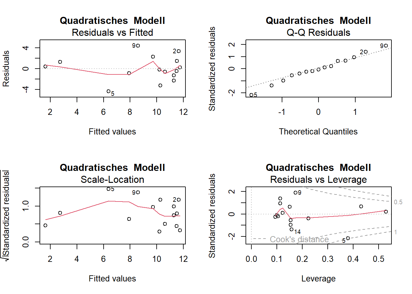
-> Die Plots sehen beim Modell mit quadratischem Term besser aus
ANCOVA
Experiment zur Fruchtproduktion (“Fruit”) von Ipomopsis sp. in Abhängigkeit von der Beweidung (“Grazing” mit 2 Levels: “Grazed”, “Ungrazed”) und korrigiert für die Pflanzengrösse vor der Beweidung (hier ausgedrückt als Durchmesser an der Spitze des Wurzelstock: “Root”)
# Daten einlesen und anschauen
compensation <- read_delim("datasets/stat/ipomopsis.csv")
compensation$Grazing <- as.factor(compensation$Grazing)

str(compensation)
spc_tbl_ [40 × 3] (S3: spec_tbl_df/tbl_df/tbl/data.frame)
$ Root : num [1:40] 6.22 6.49 4.92 5.13 5.42 ...
$ Fruit : num [1:40] 59.8 61 14.7 19.3 34.2 ...
$ Grazing: Factor w/ 2 levels "Grazed","Ungrazed": 2 2 2 2 2 2 2 2 2 2 ...
- attr(*, "spec")=
.. cols(
.. Root = col_double(),
.. Fruit = col_double(),
.. Grazing = col_character()
.. )
- attr(*, "problems")=<externalptr> summary(compensation) Root Fruit Grazing
Min. : 4.426 Min. : 14.73 Grazed :20
1st Qu.: 6.083 1st Qu.: 41.15 Ungrazed:20
Median : 7.123 Median : 60.88
Mean : 7.181 Mean : 59.41
3rd Qu.: 8.510 3rd Qu.: 76.19
Max. :10.253 Max. :116.05 # Plotten der vollständigen Daten/Information
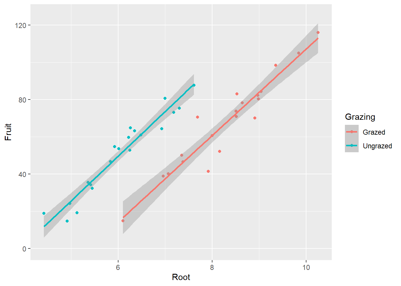
ggplot(compensation, aes(x = Root, y = Fruit, color = Grazing)) +
geom_point()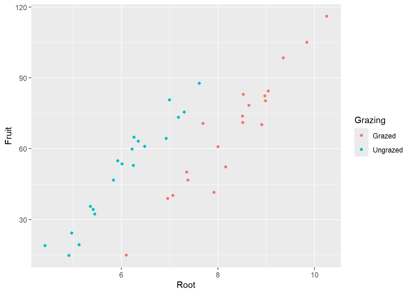
-> Je grösser die Pflanze, desto grösser ihre Fruchtproduktion. -> Die grössere Fruchtproduktion innerhalb der beweideten Gruppe scheint ein Resultat von unterschiedlichen Pflanzengrössen zwischen den Gruppen zu sein.
# Lineare Modelle definieren und anschauen

# Volles Modell mit Interaktion
aoc_1 <- lm(Fruit ~ Root * Grazing, data = compensation)
summary.aov(aoc_1)
Df Sum Sq Mean Sq F value Pr(>F)
Root 1 16795 16795 359.968 < 2e-16 ***
Grazing 1 5264 5264 112.832 1.21e-12 ***
Root:Grazing 1 5 5 0.103 0.75
Residuals 36 1680 47
---
Signif. codes: 0 '***' 0.001 '**' 0.01 '*' 0.05 '.' 0.1 ' ' 1# Finales Modell ohne die (nicht signifikante) Interaktion
aoc_2 <- lm(Fruit ~ Grazing + Root, data = compensation)
summary.aov(aoc_2) # ANOVA-Tabelle Df Sum Sq Mean Sq F value Pr(>F)
Grazing 1 2910 2910 63.93 1.4e-09 ***
Root 1 19149 19149 420.62 < 2e-16 ***
Residuals 37 1684 46
---
Signif. codes: 0 '***' 0.001 '**' 0.01 '*' 0.05 '.' 0.1 ' ' 1summary(aoc_2) # Parameter-Tabelle
Call:
lm(formula = Fruit ~ Grazing + Root, data = compensation)

Residuals:
     Min       1Q   Median       3Q      Max
-17.1920  -2.8224   0.3223   3.9144  17.3290

Coefficients:
                Estimate Std. Error t value Pr(>|t|)
(Intercept)     -127.829      9.664  -13.23 1.35e-15 ***
GrazingUngrazed   36.103      3.357   10.75 6.11e-13 ***
Root              23.560      1.149   20.51  < 2e-16 ***
---
Signif. codes:  0 '***' 0.001 '**' 0.01 '*' 0.05 '.' 0.1 ' ' 1

Residual standard error: 6.747 on 37 degrees of freedom
Multiple R-squared:  0.9291,    Adjusted R-squared:  0.9252
F-statistic: 242.3 on 2 and 37 DF,  p-value: < 2.2e-16
# Residualplots anschauen
par(mfrow = c(2, 2) ) # 2x2 Plots pro Grafik
plot(aoc_2)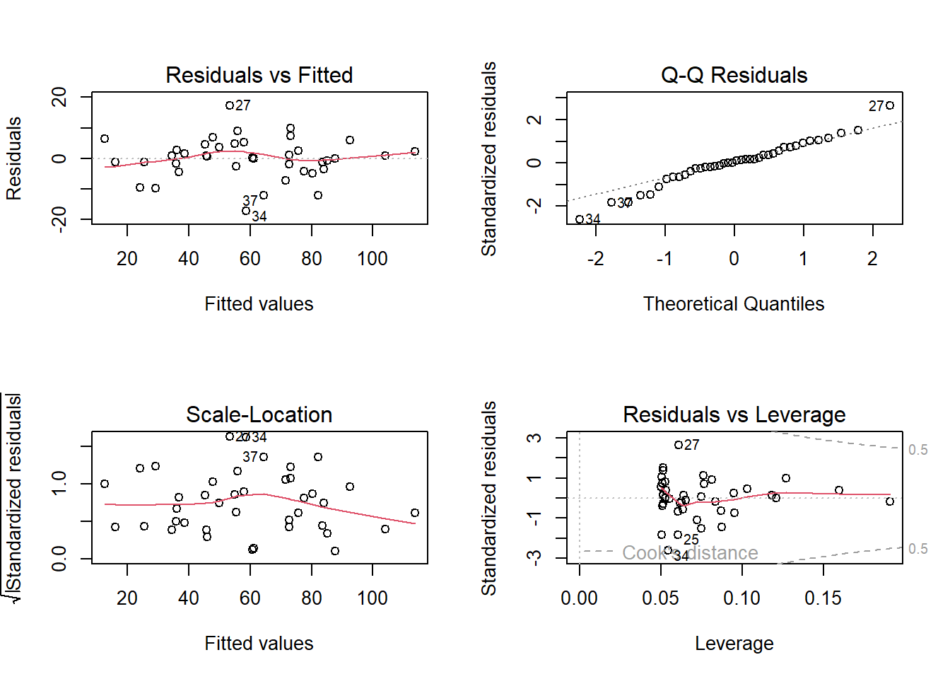
-> Das ANCOVA-Modell widerspiegelt die Zusammenhänge wie sie aufgrund der grafisch dargestellten Daten zu vermuten sind gut. Die Residual-Plots zeigen 3 Ausreisser (Beobachtungen 27, 34 und 37), welche “aus der Reihe tanzen”.
# Visualisierung
ggplot(compensation, aes(x = Root, y = Fruit, color = Grazing)) +
  geom_point() +
  stat_smooth(formula = y ~ x, method = "lm" ) +
  ylim(0, 125)